Visualization of Tumor Response – Spider Plots

A collection of some commonly used and some newly developed methods for the visualization of outcomes in oncology studies include Kaplan-Meier curves, forest plots, funnel plots, violin plots, waterfall plots, spider plots, swimmer plot, heatmaps, circos plots, transit map diagrams and network analysis diagrams (reviewed here). Previous articles in this blog presented an introduction to forest plotsviolin plots and waterfall plots as well as provided some R code for the generation of these plots. As a continuation of the series, the current article provides an introduction to spider plots for the visualization of tumor response and generation of the same using R.

Spider plots in oncology are used to depict changes in tumor measurements over time, relative to the baseline measurement. The resulting graph looks like the legs of a spider and hence the name. Additional information can be incorporated into the plot by varying the color and shape of points as well as the color and style of the lines. Here is a post on the creation of spider plots using SAS.

In domains other than medical/oncology, radar charts are sometimes also called spider plots. To clarify to readers, this post is not about the generation of radar charts.

To illustrate the generation of spider plot in R, we use as example data, the sample dataset provided along with the tumgr R package. This dataset is a sample of control arm data from a phase 3, randomized, open-label study evaluating DN-101 in combination with Docetaxel in androgen-independent prostate cancer (AIPC) (ASCENT-2). However, to illustrate the incorporation of treatment information into the plot, the subjects in this dataset were randomly placed into control and drug treatment arms. Also, the follow-up time was restricted to 240 days (8 months).

The spider plot is generated with R version 3.5.0 using package ggplot2 (version 3.0.0).


library(tumgr) ## For the example dataset
library(ggplot2)

set.seed(1234)
tumorgrowth <- sampleData
tumorgrowth <- do.call(rbind,
by(tumorgrowth, tumorgrowth$name,
     function(subset) within(subset,
              { treatment <- ifelse(rbinom(1,1,0.5), "Drug","Control")   ## subjects are randomly placed in control or drug treatment arms
                o <- order(date)
                date <- date[o]
                size <- size[o]
                baseline <- size[1]
                percentChange <- 100*(size-baseline)/baseline
                time <- ifelse(date > 240, 240, date) ## data censored at 240 days
                cstatus <- factor(ifelse(date > 240, 0, 1))
              })))
rownames(tumorgrowth) <- NULL

## Save plot in file
png(filename = "C:\\Path\\To\\SpiderPlot\\SpiderPlot.png", width = 640, height = 640)

## Plot settings
p <- ggplot(tumorgrowth, aes(x=time, y=percentChange, group=name)) +
      theme_bw(base_size=14) +
      theme(axis.title.x = element_text(face="bold"), axis.text.x = element_text(face="bold")) +
      theme(axis.title.y = element_text(face="bold"), axis.text.y = element_text(face="bold")) +
      theme(plot.title = element_text(size=18, hjust=0.5)) +
      labs(list(title = "Spider Plot", x = "Time (in days)", y = "Change from baseline (%)"))
## Now plot
p <- p + geom_line(aes(color=treatment)) +
      geom_point(aes(shape=cstatus, color=treatment), show.legend=FALSE) +
      scale_colour_discrete(name="Treatment", labels=c("Control", "Drug")) +
      scale_shape_manual(name = "cstatus", values = c("0"=3, "1"=16)) +
      coord_cartesian(xlim=c(0, 240))
print(p)
dev.off()

Here is the resulting spider plot. The + symbols represent censored observations.

Forest Plot (with Horizontal Bands)

Forest plots are often used in clinical trial reports to show differences in the estimated treatment effect(s) across various patient subgroups. See, for example a review. The page on Clinical Trials Safety Graphics includes a SAS code for a forest plot that depicts the hazard ratios for various patient subgroups (this web page has links to other interesting clinical trial graphics, as well as links to notes on best practices for graphs, and is worth checking out).

The purpose of this blog post is to create the same forest plot using R.

It should be possible to create such a graphic from first principles, using either base R graphics or using the ggplot2 package such as posted here. However, there is a contributed package forestplot that makes it very easy to make forest plots interspersed with tables – we just need to supply the right arguments to the forestplot function in the package. Also, one question that arose was how easy it would be to get the horizontal grey bands for alternate rows in the forest plot. This too was not very difficult. Following is a short explanation of the entire process, as well as the relevant R code:

First, we store the data for the plot, ForestPlotData in any convenient file format and then read it into a dataframe in R:

workdir <- ""C:\\Path\\To\\Relevant\\Directory""
datafile <- file.path(workdir,"ForestPlotData.csv")
data <- read.csv(datafile, stringsAsFactors=FALSE)

Then format the data a bit so that the column labels and columns match the required graphical output:

## Labels defining subgroups are a little indented!
subgps <- c(4,5,8,9,12,13,16,17,20,21,24,25,28,29,32,33)
data$Variable[subgps] <- paste("  ",data$Variable[subgps]) 
 
## Combine the count and percent column
np <- ifelse(!is.na(data$Count), paste(data$Count," (",data$Percent,")",sep=""), NA)
 
## The rest of the columns in the table. 
tabletext <- cbind(c("Subgroup","\n",data$Variable), 
                    c("No. of Patients (%)","\n",np), 
                    c("4-Yr Cum. Event Rate\n PCI","\n",data$PCI.Group), 
                    c("4-Yr Cum. Event Rate\n Medical Therapy","\n",data$Medical.Therapy.Group), 
                    c("P Value","\n",data$P.Value))

Finally, include the forestplot R package and call the forestplot function with appropriate arguments.

The way I got around to creating the horizontal band at every alternate row was by using settings for a very thick transparent line in the hrzl_lines argument! See below. The col=”#99999922″ option gives the light grey color to the line as well as sets it to be transparent.

A graphics device (here, a png file) with appropriate dimensions is first opened and the forest plot is saved to the device.

library(forestplot)
png(file.path(workdir,"Figures\\Forestplot.png"),width=960, height=640)
forestplot(labeltext=tabletext, graph.pos=3, 
           mean=c(NA,NA,data$Point.Estimate), 
           lower=c(NA,NA,data$Low), upper=c(NA,NA,data$High),
           title="Hazard Ratio",
           xlab="     <---PCI Better---    ---Medical Therapy Better--->",
           hrzl_lines=list("3" = gpar(lwd=1, col="#99999922"), 
                          "7" = gpar(lwd=60, lineend="butt", columns=c(2:6), col="#99999922"),
                          "15" = gpar(lwd=60, lineend="butt", columns=c(2:6), col="#99999922"),
                          "23" = gpar(lwd=60, lineend="butt", columns=c(2:6), col="#99999922"),
                          "31" = gpar(lwd=60, lineend="butt", columns=c(2:6), col="#99999922")),
           txt_gp=fpTxtGp(label=gpar(cex=1.25),
                              ticks=gpar(cex=1.1),
                              xlab=gpar(cex = 1.2),
                              title=gpar(cex = 1.2)),
           col=fpColors(box="black", lines="black", zero = "gray50"),
           zero=1, cex=0.9, lineheight = "auto", boxsize=0.5, colgap=unit(6,"mm"),
           lwd.ci=2, ci.vertices=TRUE, ci.vertices.height = 0.4)
dev.off()

Here is the resulting forest plot:

Manipulate(d) Regression!

The R package ‘manipulate’ can be used to create interactive plots in RStudio. Though not as versatile as the ‘shiny’ package, ‘manipulate’ can be used to quickly add interactive elements to standard R plots. This can prove useful for demonstrating statistical concepts, especially to a non-statistician audience.

The R code at the end of this post uses the ‘manipulate’ package with a regression plot to illustrate the effect of outliers (and influential) points on the fitted linear regression model. The resulting manipulate(d) plot in RStudio includes a gear icon, which, when clicked, opens up a slider control. The slider can be used to move some data points. The plot changes interactively with the data.

Here are some static figures:

Initial state: It is possible to move two points in the scatter plot, one at the end and one at the center.Initial

An outlier at center has a limited influence on the fitted regression model.

MoveMidY

An outlier at the ends of support of x and y ‘moves’ the regression line towards it and is also an influential point!

MoveEndY

Here is the complete R code for generating the interactive plot. This is to be run in RStudio.

library(manipulate)

## First define a custom function that fits a linear regression line 
## to (x,y) points and overlays the regression line in a scatterplot.
## The plot is then 'manipulated' to change as y values change.

linregIllustrate <- function(x, y, e, h.max, h.med){
  max.x <- max(x)
  med.x <- median(x)
  max.xind <- which(x == max.x)
  med.xind <- which(x == med.x)

  y1 <- y     ## Modified y
  y1[max.xind] <- y1[max.xind]+h.max  ## at the end
  y1[med.xind] <- y1[med.xind]+h.med  ## at the center
  plot(x, y1, xlim=c(min(x),max(x)+5), ylim=c(min(y1),max(y1)), pch=16, 
       xlab="X", ylab="Y")
  text(x[max.xind], y1[max.xind],"I'm movable!", pos=3, offset = 0.3, cex=0.7, font=2, col="red")
  text(x[med.xind], y1[med.xind],"I'm movable too!", pos=3, offset = 0.3, cex=0.7, font=2, col="red")
  
  m <- lm(y ~ x)  ## Regression with original set of points, the black line
  abline(m, lwd=2)

  m1 <- lm(y1 ~ x)  ## Regression with modified y, the dashed red line
  abline(m1, col="red", lwd=2, lty=2)
}

## Now generate some x and y data 
x <- rnorm(35,10,5)
e <- rnorm(35,0,5)
y <- 3*x+5+e

## Plot and manipulate the plot!
manipulate(linregIllustrate(x, y, e, h.max, h.med), 
           h.max=slider(-100, 100, initial=0, step=10, label="Move y at the end"), 
           h.med=slider(-100, 100, initial=0, step=10, label="Move y at the center"))

A Visualization of World Cuisines

In a previous post, we had ‘mapped’ the culinary diversity in India through a visualization of food consumption patterns. Since then, one of the topics in my to-do list was a visualization of world cuisines. The primary question was similar to that asked of the Indian cuisine: Are cuisines of geographically and culturally closer regions also similar? I recently came across an article on the analysis of recipe ingredients that distinguish the cuisines of the world. The analysis was conducted on a publicly available dataset consisting of ingredients for more than 13,000 recipes from the recipe website Epicurious. Each recipe was also tagged with the cuisine it belonged to, and there were a total of 26 different cuisines. This dataset was initially reported in an analysis of flavor network and principles of food pairing.

In this post, we (re)look the Epicurious recipe dataset and perform an exploratory analysis and visualization of ingredient frequencies among cuisines. Ingredients that are frequently found in a region’s recipes would also have high consumption in that region, and so an analysis of the ‘ingredient frequency’ of a cuisine should give us similar info as an analysis of ‘ingredient consumption’.

Outline of Analysis Method

Here is a part of the first few lines of data from the Epicurious dataset:

 Vietnamese vinegar cilantro mint olive_oil cayenne fish lime_juice
Vietnamese onion cayenne fish black_pepper seed garlic
Vietnamese garlic soy_sauce lime_juice thai_pepper
Vietnamese cilantro shallot lime_juice fish cayenne ginger  pea
Vietnamese coriander vinegar lemon lime_juice fish cayenne  scallion
Vietnamese coriander lemongrass sesame_oil beef root fish

Each row of the dataset lists the ingredients for one recipe and the first column gives the cuisine the recipe belongs to. As the first step in our analysis, we collect ALL the ingredients for each cuisine (over all the recipes for that cuisine). Then we calculate the frequency of occurrence of each ingredient in each cuisine and normalize the frequencies for each cuisine with the number of recipes available for that cuisine. This matrix of normalized ingredient frequencies is used for further analysis.

We use two approaches for the exploratory analysis of the normalized ingredient frequencies: (1) heatmap and (2) principal component analysis (pca), followed by display using biplots. The complete R code for the analysis is given at the end of this post.

Results

There are a total of 350 ingredients occurring in the dataset (among all cuisines). Some of the ingredients occur in just one cuisine, which, though interesting, will not be of much use for the current analysis. For better visual display, we restrict attention to ingredients showing most variation in normalized frequency across cuisines. The results are shown below:

Heatmap:

 Biplot:

The figures look self-explanatory and does show the clustering together of geographically nearby regions on the basis of commonly used ingredients. Moreover, we also notice the grouping together of regions with historical travel patterns (North Europe and American, Spanish_Portuguese and SouthAmerican/Mexican) or historical trading patterns (Indian and Middle East).

We need to further test the stability of the grouping obtained here by including data from the Allrecipes dataset. Also, probably taking the third principal component might dissipate some of the crowd along the PC2 axis. These would be some of the tasks for the next post…

Here is the complete R code used for the analysis:

workdir <- "C:\\Path\\To\\Dataset\\Directory"
datafile <- file.path(workdir,"epic_recipes.txt")
data <- read.table(datafile, fill=TRUE, col.names=1:max(count.fields(datafile)),
na.strings=c("", "NA"), stringsAsFactors = FALSE)

a <- aggregate(data[,-1], by=list(data[,1]), paste, collapse=",")
a$combined <- apply(a[,2:ncol(a)], 1, paste, collapse=",")
a$combined <- gsub(",NA","",a$combined) ## this column contains the totality of all ingredients for a cuisine

cuisines <- as.data.frame(table(data[,1])) ## Number of recipes for each cuisine
freq <- lapply(lapply(strsplit(a$combined,","), table), as.data.frame) ## Frequency of ingredients
names(freq) <- a[,1]
prop <- lapply(seq_along(freq), function(i) {
colnames(freq[[i]])[2] <- names(freq)[i]
freq[[i]][,2] <- freq[[i]][,2]/cuisines[i,2] ## proportion (normalized frequency)
freq[[i]]}
)
names(prop) <- a[,1] ## this is a list of 26 elements, one for each cuisine

final <- Reduce(function(...) merge(..., all=TRUE, by="Var1"), prop)
row.names(final) <- final[,1]
final <- final[,-1]
final[is.na(final)] <- 0 ## If ingredient missing in all recipes, proportion set to zero
final <- t(final) ## proportion matrix

s <- sort(apply(final, 2, sd), decreasing=TRUE)
## Selecting ingredients with maximum variation in frequency among cuisines and
## Using standardized proportions for final analysis
final_imp <- scale(subset(final, select=names(which(s > 0.1)))) 

## heatmap 
library(gplots) 
heatmap.2(final_imp, trace="none", margins = c(6,11), col=topo.colors(7), 
key=TRUE, key.title=NA, keysize=1.2, density.info="none") 

## PCA and biplot 
p <- princomp(final_imp) 
biplot(p,pc.biplot=TRUE, col=c("black","red"), cex=c(0.9,0.8), 
xlim=c(-2.5,2.5), xlab="PC1, 39.7% explained variance", ylab="PC2, 24.5% explained variance") 


Celebrating one year of blogging with a word cloud

This month marks the one year anniversary of Design Data Decisions! To celebrate, I decided to do a ‘visual display’ of this blog by creating a word cloud out of articles posted thus far. Using R.

This task turned out to be very easy, because of a cool word cloud generator function that I found in http://www.sthda.com/english/wiki/word-cloud-generator-in-r-one-killer-function-to-do-everything-you-need. So I just needed to install the required R packages ("tm", "SnowballC", "wordcloud", "RColorBrewer", "RCurl", "XML")and then call the word cloud generator function rquery.wordcloud(), supplying the blog URL as an argument, and my task was done:

source('http://www.sthda.com/upload/rquery_wordcloud.r')
url <- "https://designdatadecisions.wordpress.com"
res <- rquery.wordcloud(x=url, type="url", min.freq = 8, max.words = 200, 
        excludeWords=c("using","used","use","can","also"), colorPalette="Dark2") 
## exclude common words and restrict to words with frequency >= 8, just to get a better picture

with the resulting word cloud:

blogWordcloud

‘data’ is there, but I probably need to focus on ‘design’ and ‘decisions’ in my upcoming posts. Well, that in itself is a ‘decision’ 🙂

Drug Interaction Studies – Statistical Analysis

This post is actually a continuation of the previous post, and is motivated by this article that discusses the graphics and statistical analysis for a two treatment, two period, two sequence (2x2x2) crossover drug interaction study of a new treatment versus the standard. Whereas the previous post was devoted to implementing some of the graphics presented in the article, in this post we try to recreate the statistical analysis calculations for the data from the drug interaction study. The statistical analysis is implemented with R.

Dataset:

The drug interaction study dataset can be obtained from ocdrug.dat.txt and a brief description of the dataset is at ocdrug.txt. We first save the files to a local directory and then read the data into R dataframe and assign appropriate column labels:

ocdrug <- read.table(paste(workdir,"ocdrug.dat.txt",sep=""),sep="") 
## “workdir” is the name of the variable containing the directory name where the data file is stored 
colnames(ocdrug) <- c("ID","Seq","Period","Tmnt","EE_AUC","EE_Cmax","NET_AUC","NET_Cmax")

## Give nice names to the treatments (OCD and OC) and the treatment sequence 
ocdrug$Seq <- factor(ifelse(ocdrug$Seq == 1,"OCD-OC","OC-OCD"))
ocdrug$Tmnt <- factor(ifelse(ocdrug$Tmnt == 0,"OC","OCD"), levels = c("OC", "OCD"))

Then log transform the PK parameters:

ocdrug$logEE_AUC <- log(ocdrug$EE_AUC)
ocdrug$logEE_Cmax <- log(ocdrug$EE_Cmax)
ocdrug$logNET_AUC <- log(ocdrug$NET_AUC)
ocdrug$logNET_Cmax <- log(ocdrug$NET_Cmax)


Analysis based on Normal Theory – Linear Mixed Effects Model

We illustrate the normal theory based mixed effects model for the analysis of EE AUC. The analysis for EE Cmax and for NET AUC and Cmax are similar. We use the recommended R package nlme for developing the linear mixed effects models. The models include terms for sequence, period and treatment.

require(nlme)

options(contrasts = c(factor = "contr.treatment", ordered = "contr.poly"))
lme_EE_AUC <- lme(logEE_AUC ~ Seq+Period+Tmnt, random=(~1|ID), data=ocdrug)

From the fitted models, we can calculate the point estimates and confidence intervals for the geometric mean ratios for AUC and Cmax for EE and NET. This is illustrated for EE AUC:

tTable_EE_AUC <- summary(lme_EE_AUC)$tTable["TmntOCD",]
logEst <- tTable_EE_AUC[1]
se <- tTable_EE_AUC[2]
df <- tTable_EE_AUC[3]
t <- qt(.95,df)</pre>

## Estimate of geometric mean ratio
gmRatio_EE_AUC <- exp(logEst)
## 90% lower and upper confidence limits
LCL_EE_AUC <- exp(logEst-t*se); UCL_EE_AUC <- exp(logEst+t*se)

The calculations for Cmax and for NET are similar. We can bind all the results from normal theory model into a dataframe:

norm.out <- data.frame(type=rep("Normal Theory",4),
            cmpd=c(rep("EE",2), rep("NET",2)),
            PK=rep(c("AUC","Cmax"),2),
            ratio=c(gmRatio_EE_AUC, gmRatio_EE_Cmax, gmRatio_NET_AUC, gmRatio_NET_Cmax),
            LCL=c(LCL_EE_AUC, LCL_EE_Cmax, LCL_NET_AUC, LCL_NET_Cmax),
            UCL=c(UCL_EE_AUC, UCL_EE_Cmax, UCL_NET_AUC, UCL_NET_Cmax))
rownames(norm.out) <- paste(norm.out$cmpd,norm.out$PK,sep="_")

cat("\nSummary of normal theory based analysis\n")
cat("---------------------------------------\n")
print(round(norm.out[,4:6],2))

As discussed in the article, the diagnostic plots to assess the appropriateness of the normal theory based linear model, i.e., normal probability plots, scatter plots of observed vs. fitted values, and scatter plots of studentized residuals vs. fitted values, show some deviations from assumptions, at least for Cmax. Hence, a distribution-free or non-parametric analysis may not be unreasonable.

Distribution-free Analysis

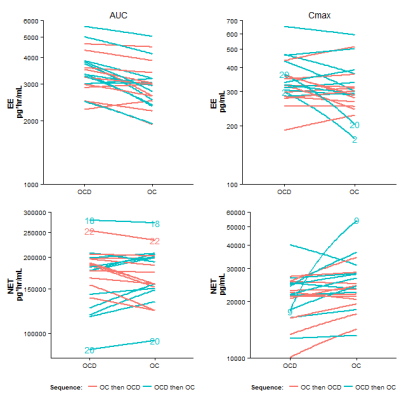
A distribution free analysis for bioequivalence is using the two sample Hodges-Lehmann point estimator and the two sample Moses confidence interval. Difference in treatment effects are estimated as the average difference in the two treatment sequence groups with respect to the within-subject period difference in the log AUC (or log Cmax) values. But we must first calculate these within-subject period differences. Transforming the dataset to a ‘wide’ format may be useful for the calculation of these within-subject differences:

ocdrug.wide <- reshape(ocdrug, v.names=c("EE_AUC", "EE_Cmax", "NET_AUC", "NET_Cmax", 
"logEE_AUC", "logEE_Cmax", "logNET_AUC", "logNET_Cmax", "Tmnt"), timevar="Period", 
idvar="ID", direction="wide", new.row.names=NULL)
ocdrug.wide$logEE_AUC_PeriodDiff <- with(ocdrug.wide, logEE_AUC.1 - logEE_AUC.2)

Similarly, the within-subject differences can be calculated for EE Cmax and NET AUC and Cmax. The two sample Hodges-Lehmann point estimator and the two sample Moses confidence interval can be calculated from these within subject differences using the the pairwiseCI function in the R-package pairwiseCI with the method=HL.diff option. Also, as specified in the article, we need to divide the estimates and CI bounds by 2 because the difference is taken twice (sequence and period).

npEst_EE_AUC <- unlist(as.data.frame(pairwiseCI(logEE_AUC_PeriodDiff ~ Seq, data=ocdrug.wide, 
                  method="HL.diff", conf.level=0.90)))
npRatio_EE_AUC <- as.numeric(exp(npEst_EE_AUC[1]/2))
npLCL_EE_AUC <- as.numeric(exp(npEst_EE_AUC[2]/2))
npUCL_EE_AUC <- as.numeric(exp(npEst_EE_AUC[3]/2))

Similarly, the estimates and confidence intervals can be obtained for EE Cmax and NET AUC and Cmax. We bind all the results obtained from distribution free theory analysis into a dataframe:

np.out <- data.frame(type=rep("Distribution Free",4),
            cmpd=c(rep("EE",2), rep("NET",2)),
            PK=rep(c("AUC","Cmax"),2),
            ratio=c(npRatio_EE_AUC, npRatio_EE_Cmax, npRatio_NET_AUC, npRatio_NET_Cmax),
            LCL=c(npLCL_EE_AUC, npLCL_EE_Cmax, npLCL_NET_AUC, npLCL_NET_Cmax),
            UCL=c(npUCL_EE_AUC, npUCL_EE_Cmax, npUCL_NET_AUC, npUCL_NET_Cmax))

rownames(np.out) <- paste(np.out$cmpd,np.out$PK,sep="_")

cat("\nSummary of distribution-free analysis\n")
cat("-------------------------------------\n")
print(round(np.out[,4:6],2))

Finally, we try to recreate figure 13 that graphically compares the results of the normal theory and distribution free analyses:

# We collect the quantities to plot in a dataframe and include a dummy x-variable
plotIt <- rbind(np.out,norm.out)
plotIt$x <- c(1,3,5,7,1.5,3.5,5.5,7.5)

# Then plot
png(filename = paste(workdir,"plotCIs.png",sep=""), width = 640, height = 640)
par(font.lab=2, font.axis=2, las=1, font=2, cex=1.6, cex.lab=0.8, cex.axis=0.8)
col=c(rep("magenta",4), rep("lightseagreen",4))
lty=c(rep(2,4),rep(1,4))
pch=c(rep(17,4), rep(16,4))
plot(ratio ~ x, data=plotIt, type="p", pch=pch, col=col, axes=FALSE, 
     xlim=c(0.5,8), ylim=c(0.7,1.35), xlab="", ylab="Ratio(OCD/OC)")
arrows(plotIt$x, plotIt$LCL, plotIt$x, plotIt$UCL, 
     code=3, length = 0.08, angle = 90, lwd=3, col=col, lty=lty)
axis(side=2, at=c(0.7,0.8,1, 1.25))
text(x=c(1,3,5,7), y=rep(0.7,4), pos=4, labels=rep(c("AUC","Cmax"),2), cex=0.8)
text(x=c(2,6), y=rep(0.65,2), pos=4, labels=c("EE","NET"), xpd=NA, cex=0.8)
abline(h=c(0.8,1,1.25),lty=3)

legend("top",c(paste("Distribution-Free","\t\t"),"Normal Theory"), 
    col=unique(col), lty=unique(lty), pch=unique(pch), horiz=TRUE, bty="n", cex=0.8, lwd=2)
dev.off()


Results

Summary of normal theory based analysis
---------------------------------------
         ratio  LCL  UCL
EE_AUC    1.16 1.11 1.23
EE_Cmax   1.10 1.01 1.19
NET_AUC   1.01 0.97 1.04
NET_Cmax  0.86 0.78 0.95

Summary of distribution-free analysis
-------------------------------------
         ratio  LCL  UCL
EE_AUC    1.16 1.11 1.24
EE_Cmax   1.08 0.99 1.20
NET_AUC   1.00 0.97 1.04
NET_Cmax  0.90 0.82 0.96


These results appear in tables 2-3 and figure 13 of the article.

Spaghetti plots with ggplot2 and ggvis

This post was motivated by this article that discusses the graphics and statistical analysis for a two treatment, two period, two sequence (2x2x2) crossover drug interaction study of a new drug versus the standard. I wanted to write about implementing those graphics and the statistical analysis in R. This post is devoted to the different ways of generating the spaghetti plot in R, and the statistical analysis part will follow in the next post.

Spaghetti plots, are often used to visualize repeated measures data. These graphs can be used to visualize time trends like this or to visualize the outcome of different treatments on the same subjects, as in figure3 of the article above. Briefly, in Spaghetti plots, the responses for the same subject, either over time or over different treatments, are connected by lines to show the subject-wise trends. Sometimes, different line types or colors are used to distinguish each subject profile. The plot looks like a plate of spaghetti, that’s probably the reason for the name.

Dataset:

The dataset for illustrating spaghetti plots can be obtained from ocdrug.dat.txt and a brief description of the dataset is at ocdrug.txt. I first saved the files to a local directory and then read the data into a R dataframe and assigned appropriate column labels:

ocdrug <- read.table(paste(workdir,"ocdrug.dat.txt",sep=""),sep="") 
## “workdir” is the name of the variable storing the directory name where the data file is stored 
colnames(ocdrug) <- c("ID","Seq","Period","Tmnt","EE_AUC","EE_Cmax","NET_AUC","NET_Cmax")

## Give nice names to the treatments (OCD and OC) and the treatment sequence 
ocdrug$Seq <- factor(ifelse(ocdrug$Seq == 1,"OCD-OC","OC-OCD"))
ocdrug$Tmnt <- factor(ifelse(ocdrug$Tmnt == 0,"OC","OCD"), levels = c("OCD", "OC"))


Spaghetti plot using ggplot2

It is possible to make a spaghetti plot using base R graphics using the function interaction.plot(). We however do not discuss this approach here, but go directly to the approach using ggplot2. We want to exactly reproduce figure 3 of the article that actually has four sub-figures. In base R, we can use mfrow(), but in ggplot2, one way to achieve this is to first create the 4 individual figures and arrange them using the grid.arrange() function in package gridExtra. First, we load the required packages,

require(ggplot2)
require(ggvis)
require(gridExtra)  ## required to arrange ggplot2 plots in a grid

and create a theme common for all the graphs:

mytheme <- theme_classic() %+replace% 
        theme(axis.title.x = element_blank(), 
        axis.title.y = element_text(face="bold",angle=90))  

We then make the first sub-figure. This is for the EE_AUC. The y-axis is in log10 scale:

p1 <- ggplot(data = ocdrug, aes(x = Tmnt, y = EE_AUC, group = ID, colour = Seq)) +
    mytheme +
    coord_trans(y="log10", limy=c(1000,6000)) +
    labs(list(title = "AUC", y = paste("EE","\n","pg*hr/mL"))) + 
    geom_line(size=1) + theme(legend.position="none")

Making the remaining three graphs follows along similar lines. Note that in the graphs p2, p3 and p4 the points for some subjects (outliers?) are labeled. We can get the labels using geom_text() and choosing the subjects to be labeled. We also include a legend below graphs p3 and p4.

p2 <- ggplot(data = ocdrug, aes(x = Tmnt, y = EE_Cmax, group = ID, colour = Seq)) +
    mytheme +
    coord_trans(y="log10", limy=c(100,700)) +
    labs(list(title = "Cmax", y = paste("EE","\n","pg/mL"))) + 
    geom_line(size=1) + 
    geom_text(data=subset(ocdrug, ID %in% c(2,20)), aes(Tmnt,EE_Cmax,label=ID)) +
    theme(legend.position="none")

p3 <- ggplot(data = ocdrug, aes(x = Tmnt, y = NET_AUC, group = ID, colour = Seq)) +
    mytheme +
    coord_trans(y="log10", limy=c(80000,300000)) +    
    labs(list(y = paste("NET","\n","pg*hr/mL"))) + 
    geom_line(size=1) + 
    geom_text(data=subset(ocdrug, ID %in% c(18,22,20)), aes(label=ID), show_guide = F) +
    scale_colour_discrete(name="Sequence: ", labels=c("OCD then OC", "OC then OCD")) + 
    theme(legend.position="bottom")

p4 <- ggplot(data = ocdrug, aes(x = Tmnt, y = NET_Cmax, group = ID, colour = Seq)) +
    mytheme +
    coord_trans(y="log10", limy=c(10000,60000)) +
    labs(list(y = paste("NET","\n","pg/mL"))) + 
    geom_line(size=1) + 
    geom_text(data=subset(ocdrug, ID == 9), aes(label=ID), show_guide = F) +
    scale_colour_discrete(name="Sequence: ", labels=c("OCD then OC", "OC then OCD")) + 
    theme(legend.position="bottom")

Finally, we arrange plots p1 through p4 as a matrix, using the function grid.arrange() and save it to a .png file:

png(filename = paste(workdir,"ByTmnt_ggplot2.png",sep=""), width = 640, height = 640, bg="transparent")
grid.arrange(p1, p2, p3, p4, ncol = 2)
dev.off()

Creating an interactive spaghetti plot with ggvis

Having recreated figure3 of the article using ggplot2, I then wanted to make an interactive version of the plot. The R package ggvis can be used to provide some interactive features. Here is the user interaction that we wish to add:

  1. To be able to select which (of the four) plot to view
  2. To provide a tooltip to the user, that gives info on the subject ID when the cursor is pointed at a point or line in the graph

To create a plot in ggvis that includes a tooltip, we need to first create an identifier for each row in the dataset like so:

 
ocdrug$uid <- 1:nrow(ocdrug)  # Add an unique id column to use as the key
all_values <- function(x) {
  if(is.null(x)) return(NULL)
  row <- ocdrug[ocdrug$uid == x$uid,]
  paste0(names(row[1]), ": ", format(row[1]))
}

Then,

 
ocdrug <- group_by(ocdrug, ID) ## Data is grouped, by subjects ocdrug %>% 

ocdrug %>% 
  ggvis(x = ~Tmnt, y = input_select(c("EE: AUC" = "EE_AUC", "EE: Cmax" = "EE_Cmax",
            "NET: AUC" = "NET_AUC", "NET: Cmax" = "NET_Cmax"), 
            label="Y-aixs variable", map = as.name)) %>%    ## choose which graph to display
  layer_paths(stroke = ~Seq) %>%    ## color lines by treatment sequence as before
  layer_points(fill = ~Seq) %>%        ## color points by treatment sequence as before
  layer_points(fill = ~Seq, key := ~uid) %>%    ## having to do it twice, 
         ## else the points just seemed to appear and disappear. Have not understood why?
  add_axis("x", title = "Group", title_offset = 50, grid=FALSE) %>%    ## Axes and legend
  add_axis("y", title = "", grid=FALSE) %>%
  scale_numeric("y", trans="log") %>%
  hide_legend("stroke") %>%
  add_legend("fill", title = "Sequence") %>%
  add_tooltip(all_values, "hover")    ## Finally add the tooltip

To display the interactive plot, copy the above code and paste it in an R session. The plot would appear in the browser. The R session should be kept open. The plot below is only a screenshot from the browser and is not interactive.

Spaghetti_ggvis

My original aim was actually to create an interactive version of the ggplot2 graphic that displays all the four graphs at once, but also includes a tooltip, instead of the text labels for selected subjects. I also wanted that pointing at one subject in one particular graph will highlight the profile for that subject, not only that graph, but in the remaining three graphs as well. It however looks like, now, ggvis does not support multiple graphs in the same page. A full-fledged Shiny app may be a solution for someone with no knowledge of html, css, Java etc… I welcome experts to share any other ideas by which such interactivity can be achieved.

Waterfall plots – what and how?

Waterfall plots” are nowadays often used in oncology clinical trials for a graphical representation of the quantitative response of each subject to treatment. For an informative article explaining waterfall plots see Understanding Waterfall Plots.

In this post, we illustrate the creation of waterfall plots in R.

In a typical waterfall plot, the x-axis serves as the baseline value of the response variable. For each subject, vertical bars are drawn from the baseline, either in the positive or negative direction to depict the change from baseline in the response for the subject. The y-axis thus represents the change from baseline in the response, usually expressed as a percentage, for e.g., percent change in the size of the tumor or percent change in some marker level. Most importantly, in a waterfall plot, the bars are ordered in the decreasing order of the percent change values.

Though waterfall plots have gained popularity in oncology, they can be used for data visualization in other clinical trials as well, where the response is expressed as a change from baseline.

Dataset:

Instead of a tumor growth dataset, we illustrate creation of waterfall plots for the visual depiction of a quality of life data. A quality of life dataset, dataqol2 is available with the R package QoLR.

require(QoLR)
?dataqol2
data(dataqol2)
head(dataqol2)
dataqol2$id <- as.factor(dataqol2$id)
dataqol2$time <- as.factor(dataqol2$time)
dataqol2$arm <- as.factor(dataqol2$arm)

dataqol2 contains longitudinal data on scores for 2 quality of life measures (QoL and pain) for 60 subjects. In the case of QoL, higher scores are better since they imply better quality of life, and for pain, lower scores are better since they imply a decrease in pain. Each subject has these scores recorded at baseline (time = 0) and then at a maximum of 5 more time points post baseline. ‘arm’ represents the treatment arm to which the subjects were assigned. The dataset is in long format.

The rest of this post is on creating a waterfall plot in R for the QoL response variable.

Creating a waterfall plot using the barplot function in base R

The waterfall plot is basically an ‘ordered bar chart’, where each bar represents the change from baseline response measure for the corresponding subject.

As the first step, it would be helpful if we change the format of the dataset from ‘long’ to ‘wide’. We use the reshape function to do this. Also, we retain only the QoL scores, but not the pain scores:

qol2.wide <- reshape(dataqol2, v.names="QoL", idvar = "id", timevar = "time", direction = "wide", drop=c("date","pain"))

For each subject, we then find the best (largest) QoL score value post baseline, compute the best percentage change from baseline and order the dataframe in the decreasing order of the best percentage changes. We also remove subjects with missing percent change values:

qol2.wide$bestQoL <- apply(qol2.wide[,5:9], 1 ,function(x) ifelse(sum(!is.na(x)) == 0, NA, max(x,na.rm=TRUE)))
qol2.wide$bestQoL.PerChb <- ((qol2.wide$bestQoL-qol2.wide$QoL.0)/qol2.wide$QoL.0)*100

o <- order(qol2.wide$bestQoL.PerChb,decreasing=TRUE,na.last=NA)
qol2.wide <- qol2.wide[o,]

Create the waterfall plot… Finally!

barplot(qol2.wide$bestQoL.PerChb, col="blue", border="blue", space=0.5, ylim=c(-100,100),
main = "Waterfall plot for changes in QoL scores", ylab="Change from baseline (%) in QoL score",
cex.axis=1.2, cex.lab=1.4)

waterfall_base_Plain

Since we are depicting changes in quality of life scores, the higher the bar is in the positive direction, the better the improvement in the quality of life. So, the above figure shows that, for most subjects, there was improvement in the quality of life post baseline.

We can also color the bars differently by treatment arm, and include a legend. I used the choose_palette() function from the excellent colorspace R package to get some nice colors.

col <- ifelse(qol2.wide$arm == 0, "#BC5A42", "#009296")
barplot(qol2.wide$bestQoL.PerChb, col=col, border=col, space=0.5, ylim=c(-100,100),
main = "Waterfall plot for changes in QoL scores", ylab="Change from baseline (%) in QoL score",
cex.axis=1.2, cex.lab=1.4, legend.text=c(0,1),
args.legend=list(title="Treatment arm", fill=c("#BC5A42","#009296"), border=NA, cex=0.9))

waterfall_base_Tmnt

Treatment arm 1 is associated with the largest post baseline increases in the quality of life score. Since waterfall plots are basically bar charts, they can be colored by other relevant subject attributes as well.

The above is a solution to creating waterfall plots using base R graphics function barplot. It is my aim to simultaneously also develop a solution using the ggplot2 package (and in the process, develop expertise in ggplot2). So here it is…

Creating a waterfall plot using ggplot2

We use the previously created qol2.wide dataframe, but in ggplot2, we also need an x variable. So:

require(ggplot2)
x <- 1:nrow(qol2.wide)

Next we specify some plot settings, we color bars differently by treatment arm and allow the default colors of ggplot2, since I think they are quite nice. We also want to remove the x-axis, and put sensible limits for the y-axis:

b <- ggplot(qol2.wide, aes(x=x, y=bestQoL.PerChb, fill=arm, color=arm)) +
scale_fill_discrete(name="Treatment\narm") + scale_color_discrete(guide="none") +
labs(list(title = "Waterfall plot for changes in QoL scores", x = NULL, y = "Change from baseline (%) in QoL score")) +
theme_classic() %+replace%
theme(axis.line.x = element_blank(), axis.text.x = element_blank(), axis.ticks.x = element_blank(),
axis.title.y = element_text(face="bold",angle=90)) +
coord_cartesian(ylim = c(-100,100))

Finally, the actual bars are drawn using geom_bar(), and we specify the width of the bars and the space between bars. We specify stat="identity" because we want the heights of the bars to represent actual values in the data. See ?geom_bar

 b <- b + geom_bar(stat="identity", width=0.7, position = position_dodge(width=0.4))

waterfall_ggplot2

Update: Readers pointed out about a ‘waterfall chart’ in finance that seems to be somewhat different than the graphic discussed in this post, and they seem to use the word ‘chart’ instead of ‘plot’. Here is some info, that also includes some R code for the waterfall chart used in finance. Here is yet another plot referred to as ‘waterfall plot’ that seems to be used to display spectra.

Waterfall seems to be quite a popular name for plots!

Graphical presentation of data, best practices

Show the data, don’t conceal them was the first article from a series of articles published in the British Journal of Pharmacology that deals with the best practices to be followed in statistical reporting. The current set of articles in this series can be obtained at http://onlinelibrary.wiley.com/journal/10.1111/%28ISSN%291476-5381/homepage/statistical_reporting.htm.

“Show the data…” deals with the graphical presentation of data. The article urges authors to present data in its ‘raw form’, that would show all the characteristics of the data distribution. The use of the so-called ‘dynamite plunger plot’ is discouraged. In a ‘dynamite plunger plot’ the mean of the data is represented by a bar and there is a ‘T’ at the top of the bar to show variability. It is argued that dynamite plunger plots can give a false notion of symmetry in the data. The conclusion of the article is that data can be better presented and compared using simple dotplots.

For those interested, the previous post in this blog was also on the graphical representation of data and included simple R code for generating different ‘types’ of dotplots.

Graphs in R – Overlaying Data Summaries in Dotplots

Dotplots are useful for the graphical visualization of small to medium-sized datasets. These simple plots provide an overview of how the data is distributed, whilst also showing the individual observations. It is however possible to make the simple dotplots more informative by overlaying them with data summaries and/or smooth distributions.

This post is about creating such superimposed dotplots in R – we first see how to create these plots using just base R graphics, and then proceed to create them using the ggplot2 R package.

## First things first - dataset 'chickwts': Weights of
## chickens fed with any one of six different feed types

?chickwts
data(chickwts)  ## load the dataset


Graphs using base R:

## First some plot settings

par(cex.main=0.9,cex.lab=0.8,font.lab=2,cex.axis=0.8,font.axis=2,col.axis="grey50")

We first create a dotplot where the median of each group is also displayed as a horizontal line:

## Getting the dotplot first, expanding the x-axis to leave room for the line
stripchart(weight ~ feed, data = chickwts, xlim=c(0.5,6.5), vertical=TRUE, method = "stack", offset=0.8, pch=19,
main = "Chicken weights after six weeks", xlab = "Feed Type", ylab = "Weight (g)")

## Then compute the group-wise medians
medians <- tapply(chickwts[,"weight"], chickwts[,"feed"], median)

## Now add line segments corresponding to the group-wise medians
loc <- 1:length(medians)
segments(loc-0.3, medians, loc+0.3, medians, col="red", lwd=3)

Next , we create a dotplot where the median is shown, along with the 1st and 3rd quartile, i.e., the ‘box’ of the boxplot of the data is overlaid with the dotplot:

## Getting the dotplot first, expanding the x-axis to leave room for the box
stripchart(weight ~ feed, data = chickwts, xlim=c(0.5,6.5), vertical=TRUE, method="stack", offset=0.8, pch=19,
main = "Chicken weights after six weeks", xlab = "Feed Type", ylab = "Weight (g)")

## Now draw the box, but without the whiskers!
boxplot(weight ~ feed, data = chickwts, add=TRUE, range=0, whisklty = 0, staplelty = 0)

Plots similar to ones created above, but using the ggplot2 R package instead:

## Load the ggplot2 package first
library(ggplot2)

## Data and plot settings
p <- ggplot(chickwts, aes(x=feed, y=weight)) +
labs(list(title = "Chicken weights after six weeks", x = "Feed Type", y = "Weight (g)")) +
theme(axis.title.x = element_text(face="bold"), axis.text.x = element_text(face="bold")) +
theme(axis.title.y = element_text(face="bold"), axis.text.y = element_text(face="bold"))

We use the stat_summary function to plot the median line as an errorbar, but we need to define our own function that calculates the group-wise median and produces output in a format suitable for stat_summary like so:

## define custom median function
plot.median <- function(x) {
  m <- median(x)
  c(y = m, ymin = m, ymax = m)
}

## dotplot with median line
p1 <- p + geom_dotplot(binaxis='y', stackdir='center', method="histodot", binwidth=5) +
stat_summary(fun.data="plot.median", geom="errorbar", colour="red", width=0.5, size=1)
print(p1)

For the dotplot overlaid with the median and the 1st and 3rd quartile, the ‘box’ from the boxplot is plotted using geom_boxplot function:

## dotplot with box
p2 <- p + geom_boxplot(aes(ymin=..lower.., ymax=..upper..)) +
geom_dotplot(binaxis='y', stackdir='center', method="histodot", binwidth=5)
print(p2)

Additionally, let’s also plot a dotplot with a violin plot overlaid. We cannot do this in base R!

## dotplot with violin plot
## and add some cool colors
p3 <- p + geom_violin(scale="width", adjust=1.5, trim = FALSE, fill="indianred1", color="darkred", size=0.8) +
geom_dotplot(binaxis='y', stackdir='center', method="histodot", binwidth=5)
print(p3)