“Waterfall plots” are nowadays often used in oncology clinical trials for a graphical representation of the quantitative response of each subject to treatment. For an informative article explaining waterfall plots see Understanding Waterfall Plots.
In this post, we illustrate the creation of waterfall plots in R.
In a typical waterfall plot, the x-axis serves as the baseline value of the response variable. For each subject, vertical bars are drawn from the baseline, either in the positive or negative direction to depict the change from baseline in the response for the subject. The y-axis thus represents the change from baseline in the response, usually expressed as a percentage, for e.g., percent change in the size of the tumor or percent change in some marker level. Most importantly, in a waterfall plot, the bars are ordered in the decreasing order of the percent change values.
Though waterfall plots have gained popularity in oncology, they can be used for data visualization in other clinical trials as well, where the response is expressed as a change from baseline.
Dataset:
Instead of a tumor growth dataset, we illustrate creation of waterfall plots for the visual depiction of a quality of life data. A quality of life dataset, dataqol2 is available with the R package QoLR.
require(QoLR)
?dataqol2
data(dataqol2)
head(dataqol2)
dataqol2$id <- as.factor(dataqol2$id)
dataqol2$time <- as.factor(dataqol2$time)
dataqol2$arm <- as.factor(dataqol2$arm)
dataqol2 contains longitudinal data on scores for 2 quality of life measures (QoL and pain) for 60 subjects. In the case of QoL, higher scores are better since they imply better quality of life, and for pain, lower scores are better since they imply a decrease in pain. Each subject has these scores recorded at baseline (time = 0) and then at a maximum of 5 more time points post baseline. ‘arm’ represents the treatment arm to which the subjects were assigned. The dataset is in long format.
The rest of this post is on creating a waterfall plot in R for the QoL response variable.
Creating a waterfall plot using the barplot function in base R
The waterfall plot is basically an ‘ordered bar chart’, where each bar represents the change from baseline response measure for the corresponding subject.
As the first step, it would be helpful if we change the format of the dataset from ‘long’ to ‘wide’. We use the reshape function to do this. Also, we retain only the QoL scores, but not the pain scores:
qol2.wide <- reshape(dataqol2, v.names="QoL", idvar = "id", timevar = "time", direction = "wide", drop=c("date","pain"))
For each subject, we then find the best (largest) QoL score value post baseline, compute the best percentage change from baseline and order the dataframe in the decreasing order of the best percentage changes. We also remove subjects with missing percent change values:
qol2.wide$bestQoL <- apply(qol2.wide[,5:9], 1 ,function(x) ifelse(sum(!is.na(x)) == 0, NA, max(x,na.rm=TRUE)))
qol2.wide$bestQoL.PerChb <- ((qol2.wide$bestQoL-qol2.wide$QoL.0)/qol2.wide$QoL.0)*100

o <- order(qol2.wide$bestQoL.PerChb,decreasing=TRUE,na.last=NA)
qol2.wide <- qol2.wide[o,]
Create the waterfall plot… Finally!
barplot(qol2.wide$bestQoL.PerChb, col="blue", border="blue", space=0.5, ylim=c(-100,100),
main = "Waterfall plot for changes in QoL scores", ylab="Change from baseline (%) in QoL score",
cex.axis=1.2, cex.lab=1.4)

Since we are depicting changes in quality of life scores, the higher the bar is in the positive direction, the better the improvement in the quality of life. So, the above figure shows that, for most subjects, there was improvement in the quality of life post baseline.
We can also color the bars differently by treatment arm, and include a legend. I used the choose_palette() function from the excellent colorspace R package to get some nice colors.
col <- ifelse(qol2.wide$arm == 0, "#BC5A42", "#009296")
barplot(qol2.wide$bestQoL.PerChb, col=col, border=col, space=0.5, ylim=c(-100,100),
main = "Waterfall plot for changes in QoL scores", ylab="Change from baseline (%) in QoL score",
cex.axis=1.2, cex.lab=1.4, legend.text=c(0,1),
args.legend=list(title="Treatment arm", fill=c("#BC5A42","#009296"), border=NA, cex=0.9))
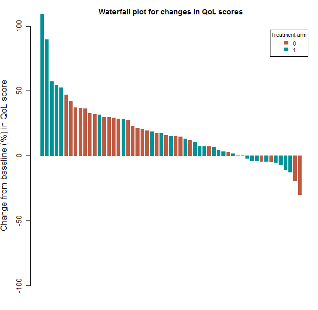
Treatment arm 1 is associated with the largest post baseline increases in the quality of life score. Since waterfall plots are basically bar charts, they can be colored by other relevant subject attributes as well.
The above is a solution to creating waterfall plots using base R graphics function barplot. It is my aim to simultaneously also develop a solution using the ggplot2 package (and in the process, develop expertise in ggplot2). So here it is…
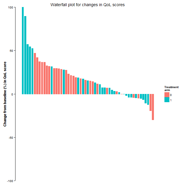
Creating a waterfall plot using ggplot2
We use the previously created qol2.wide dataframe, but in ggplot2, we also need an x variable. So:
require(ggplot2)
x <- 1:nrow(qol2.wide)
Next we specify some plot settings, we color bars differently by treatment arm and allow the default colors of ggplot2, since I think they are quite nice. We also want to remove the x-axis, and put sensible limits for the y-axis:
b <- ggplot(qol2.wide, aes(x=x, y=bestQoL.PerChb, fill=arm, color=arm)) +
scale_fill_discrete(name="Treatment\narm") + scale_color_discrete(guide="none") +
labs(list(title = "Waterfall plot for changes in QoL scores", x = NULL, y = "Change from baseline (%) in QoL score")) +
theme_classic() %+replace%
theme(axis.line.x = element_blank(), axis.text.x = element_blank(), axis.ticks.x = element_blank(),
axis.title.y = element_text(face="bold",angle=90)) +
coord_cartesian(ylim = c(-100,100))
Finally, the actual bars are drawn using geom_bar(), and we specify the width of the bars and the space between bars. We specify stat="identity" because we want the heights of the bars to represent actual values in the data. See ?geom_bar
b <- b + geom_bar(stat="identity", width=0.7, position = position_dodge(width=0.4))
Update: Readers pointed out about a ‘waterfall chart’ in finance that seems to be somewhat different than the graphic discussed in this post, and they seem to use the word ‘chart’ instead of ‘plot’. Here is some info, that also includes some R code for the waterfall chart used in finance. Here is yet another plot referred to as ‘waterfall plot’ that seems to be used to display spectra.
Waterfall seems to be quite a popular name for plots!

Your readers might be interested in a very similar article that I wrote a few months ago.
http://blogs.sas.com/content/iml/2015/04/20/waterfall-plot.html
LikeLike
Thank you very much for the link and for the SAS code for creating the waterfall graphic.
LikeLike
[…] Waterfall plots – what and how? Waterfall plots’ are nowadays often used in oncology clinical trials for a graphical representation of the quantitative response of each subject to treatment. For an informative article explaining waterfall plots see Understanding Waterfall Plots. In this post, we illustrate the creation of waterfall plots in R. […]
LikeLike
Hi,
Thanks very much for the tutorial. Could it be possible to know if there is a way of plotting the chart in 3D to add a second variable in a horizontal axis? Thanks
Regards
IOM
LikeLike
Since the waterfall plot is essentially a bar chart, it should be possible to do a 3d version of the same, using perhaps ideas in http://stackoverflow.com/questions/26794236/ggplot2-3d-bar-plot . You may also consider perhaps multiple waterfall plots or color coded bars for the second x variable. Thanks.
LikeLike
Thanks, I already found the way with rgl package. Cheers
LikeLike
[…] and negative values. ➘ “Waterfall Chart” Understanding Waterfall Plots Waterfall plots – what and how? […]
LikeLike