Forest plots are often used in clinical trial reports to show differences in the estimated treatment effect(s) across various patient subgroups. See, for example a review. The page on Clinical Trials Safety Graphics includes a SAS code for a forest plot that depicts the hazard ratios for various patient subgroups (this web page has links to other interesting clinical trial graphics, as well as links to notes on best practices for graphs, and is worth checking out).
The purpose of this blog post is to create the same forest plot using R.
It should be possible to create such a graphic from first principles, using either base R graphics or using the ggplot2 package such as posted here. However, there is a contributed package forestplot that makes it very easy to make forest plots interspersed with tables – we just need to supply the right arguments to the forestplot function in the package. Also, one question that arose was how easy it would be to get the horizontal grey bands for alternate rows in the forest plot. This too was not very difficult. Following is a short explanation of the entire process, as well as the relevant R code:
First, we store the data for the plot, ForestPlotData in any convenient file format and then read it into a dataframe in R:
workdir <- ""C:\\Path\\To\\Relevant\\Directory""
datafile <- file.path(workdir,"ForestPlotData.csv")
data <- read.csv(datafile, stringsAsFactors=FALSE)
Then format the data a bit so that the column labels and columns match the required graphical output:
## Labels defining subgroups are a little indented!
subgps <- c(4,5,8,9,12,13,16,17,20,21,24,25,28,29,32,33)
data$Variable[subgps] <- paste("  ",data$Variable[subgps])

## Combine the count and percent column
np <- ifelse(!is.na(data$Count), paste(data$Count," (",data$Percent,")",sep=""), NA)

## The rest of the columns in the table.
tabletext <- cbind(c("Subgroup","\n",data$Variable),
                    c("No. of Patients (%)","\n",np),
                    c("4-Yr Cum. Event Rate\n PCI","\n",data$PCI.Group),
                    c("4-Yr Cum. Event Rate\n Medical Therapy","\n",data$Medical.Therapy.Group),
                    c("P Value","\n",data$P.Value))
Finally, include the forestplot R package and call the forestplot function with appropriate arguments.
The way I got around to creating the horizontal band at every alternate row was by using settings for a very thick transparent line in the hrzl_lines argument! See below. The col=”#99999922″ option gives the light grey color to the line as well as sets it to be transparent.
A graphics device (here, a png file) with appropriate dimensions is first opened and the forest plot is saved to the device.
library(forestplot)
png(file.path(workdir,"Figures\\Forestplot.png"),width=960, height=640)
forestplot(labeltext=tabletext, graph.pos=3,
           mean=c(NA,NA,data$Point.Estimate),
           lower=c(NA,NA,data$Low), upper=c(NA,NA,data$High),
           title="Hazard Ratio",
           xlab="     <---PCI Better---    ---Medical Therapy Better--->",
           hrzl_lines=list("3" = gpar(lwd=1, col="#99999922"),
                          "7" = gpar(lwd=60, lineend="butt", columns=c(2:6), col="#99999922"),
                          "15" = gpar(lwd=60, lineend="butt", columns=c(2:6), col="#99999922"),
                          "23" = gpar(lwd=60, lineend="butt", columns=c(2:6), col="#99999922"),
                          "31" = gpar(lwd=60, lineend="butt", columns=c(2:6), col="#99999922")),
           txt_gp=fpTxtGp(label=gpar(cex=1.25),
                              ticks=gpar(cex=1.1),
                              xlab=gpar(cex = 1.2),
                              title=gpar(cex = 1.2)),
           col=fpColors(box="black", lines="black", zero = "gray50"),
           zero=1, cex=0.9, lineheight = "auto", boxsize=0.5, colgap=unit(6,"mm"),
           lwd.ci=2, ci.vertices=TRUE, ci.vertices.height = 0.4)
dev.off()
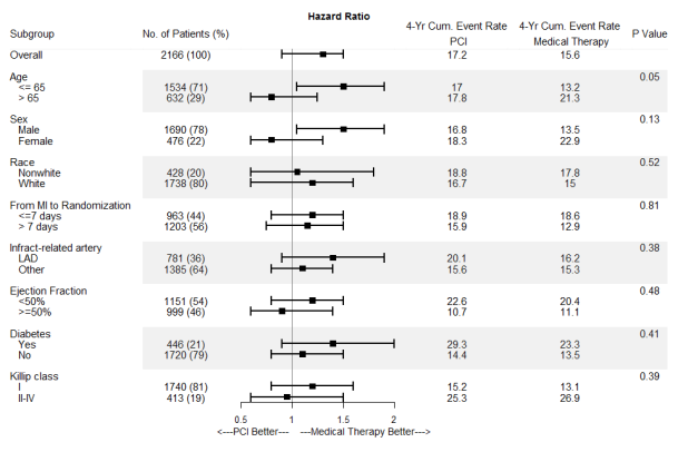
Here is the resulting forest plot:

Hi Jyothi! Thanks for such a great R package. I use it a lot at my company actually. I have a naïve question because I am a novice R user – how do you add a footnote to the plot? I just want to add the date and time as well as the path indicating the location of the source documents. I guess it would take up multiple lines (3?) Thank you!
LikeLike
Hi! Thanks!, But I’m not the author of the forestplot package 🙂 I just used the package.
With respect to your question, it does look like the forestplot function does not have an argument to support footnotes. However, since it is based on grid graphics, without making too much of a change in the rest of the plot alignment, we can probably add two lines of text by including the following code just before the dev.off() statement:
grid.text(paste(“Date & time:”,date()), 0.01, 0.03, just=0, gp=gpar(cex=1))
grid.text(paste(“Source:”,”C:\\Path\\to\\source_file_location\\”), 0.01, 0.01, just=0, gp=gpar(cex=1))
The above should put the time stamp and file location below the plot. Hope this helps.
LikeLiked by 2 people
Hello I cannot obtain your same graphs: I received a message after running png(file.path(workdir,”Figures\\Forestplot.png”),width=960, height=640)
of Error in png(file.path(workdir, “Figures\\Forestplot.png”), width = 960, : unable to start png() device.
When I add type=”cairo” line is recognized however later:
Error in grid.Call(L_convert, x, as.integer(whatfrom), as.integer(whatto), : could not open file
Could you please provide an explanation?
Thanks
LikeLike
Hi! Thank you for trying the code.
The plot actually gets saved to a sub-directory named “Figures” within “workdir”. So if this directory is not present, the error is thrown. Unfortunately, I missed allowing the program to create the sub-directory if it did not exist. My mistake! Can you first try creating a “Figures” sub-directory within your “workdir” and then try again?
LikeLike
I was trying to create similar plot. I still could not understand your data structure. How you had arranged your data. Could you please share your data. Thanks
LikeLike
Hi! The link to the dataset is given in the post itself as an MS Excel file. You may however have to save the file locally in .csv format before trying the read.csv() option.
LikeLiked by 1 person
Hi
I have a quick question that I tried to follow the instruction:
data$Variable[subgps] <- paste(" ",data$Variable[subgps])
But I got the following error message. Please advise. Many thanks in advance.
———————————————————————————–
Error in `$<-.data.frame`(`*tmp*`, "Variable", value = c("Overall", NA, :
replacement has 33 rows, data has 1
YS
LikeLike
Hi Jyothi,
Many thanks for your post. I have a question, how do you italicise or made bold the column names and the subheadings for the subgroups (age, sex, race etc)?
BW,
Amanda
LikeLike
Hey
I like to reproduce your plot.
Unfortunately I have some errors ….
can you please help me ?
Warning message:
In is.na(data$Count) :
is.na() applied to non-(list or vector) of type ‘NULL’
Warning message:
In cbind(c(“Subgroup”, “\n”, data$Variable), c(“No. of Patients (%)”, :
number of rows of result is not a multiple of vector length (arg 2)
Error in forestplot.default(labeltext = tabletext, graph.pos = 3, mean = c(NA, :
You have provided 2 rows in your mean arguement while the labels have 35 rows
LikeLiked by 1 person
Hi Tom,
unfortunately I have the same problem. Did you find any solution for this?
Kind regards,
Alex
LikeLiked by 2 people
Thanks much Jyothi,
Your post was of great help.
Cheers,
Bart
LikeLiked by 1 person
Thank You Jyothi,
Your syntax is very helpful for me.
Only I have one concern, hope you should solve my issue.
My concern is, On my graph the point estimate point plotted on interval line and that is very big.
so can you help me please how would I decrease their size?
LikeLike
Hi! Try reducing the value of the boxsize argument and see if that resolves the issue.
LikeLike
Only one suggestion. Your forest plot is amazing, and it’s exactly what I was looking for.
However, to be PERFECT, the size of the squares should be proportional to the number of patients in that analysis. Actually, in a meta-analysis, they are related to the inverse of variance, which in turn, is related to the sample size.
To be MORE THAN PERFECT, and now I know that I’m asking too much, it should be able to create the forest plot using the raw data. The same data you used to perform the Cox regression, instead of reorganizing the data in another sheet.
For what it’s worth, people have added a ggplot2-based function to create a forest plot for the cox model in the survminer package (https://www.r-bloggers.com/forest-plot-with-horizontal-bands/).
However, their forest plot is still wrong because, I believe, they were not able to perform the analyses by each subgroup.
Congrats!
LikeLike
Thank you so much for your nice comments!
The default value of boxsize parameter should make the size of the square inversely proportional to the precision of the estimate. Getting the plot from raw data might be a little more difficult and I can try to do that in a future post!
LikeLike
This has been very helpful, thanks for the great example!
Do you know if there is a way to code multiple colors for the error bars in the forest plot?
I am trying to conditionally color the error bar lines of the plot based on statistical significance (using the p-value and CI in my data table (green, red, and grey). Do you have any suggestions on how to do this within fpcolor? I’ve tried a few things and it hasn’t worked…
thanks!
Kk
LikeLike
Hi there,
Thanks for this! It has been super helpful.
I’m working on putting together a forest plot that has multiple confidence bands (like shown in the vignette https://cran.r-project.org/web/packages/forestplot/vignettes/forestplot.html), but would like to introduce horizontal bands as you’ve shown to set each row apart. However, when I do this, the bands always end up in between each of my row labels. Do you have any suggestions on how to rectify this? Thanks!
LikeLike
Hi.. You may try varying the lwd (line width) and the row numbers in the parameter list of the hrzl_lines argument of the forestplot function. Best luck!
LikeLike
Hi- I’m getting a beautiful shell but no data shows up. And I get this error.
Error in grid.Call.graphics(C_setviewport, vp, TRUE) :
invalid ‘layout.pos.col’
I’m very new to this so sorry if this is stupid….
LikeLike
[…] analysis diagrams (reviewed here). Previous articles in this blog presented an introduction to forest plots, violin plots and waterfall plots as well as provided some R code for the generation of these […]
LikeLike
Your forest plot looks great! Unfortfunately I receive this error too:
“cbind(c(“Subgroup”, “\n”, data$Variable), c(“No. of Patients (%)”, :
number of rows of result is not a multiple of vector length (arg 2)”
Can anyone help me?
LikeLike
Hi.. did you try running the code with the example dataset linked to in the article. If you are able to run it successfully with the example dataset but not with your data, the please check that the format of your data matches the example. Hope this helps.
LikeLike
Thank you for your assistance!
I used your dataset. 30min ago I found the solution. For some reason I had to use
data <- read.csv2(datafile, stringsAsFactors=FALSE) instead of .csv. I think there is a conflict with the german .csv files cause of the "," and ";".
Kind regards,
Alex
LikeLiked by 1 person
Hi Jyothi, thank you for the very useful tutorial. I was having trouble specifying the size of the x axis labels and your code was super helpful.
LikeLiked by 1 person
Hi, I can’t reproduce the plot using the same script. It shows an error sign:
“Error in forestplot.default(labeltext = tabletext, graph.pos = 3, mean = c(NA, :
You have provided 2 rows in your mean arguement while the labels have 35 rows”.
Any help please!
LikeLike
This was super helpful, thanks so much!
LikeLike